Royal Hills Estate Business Cards
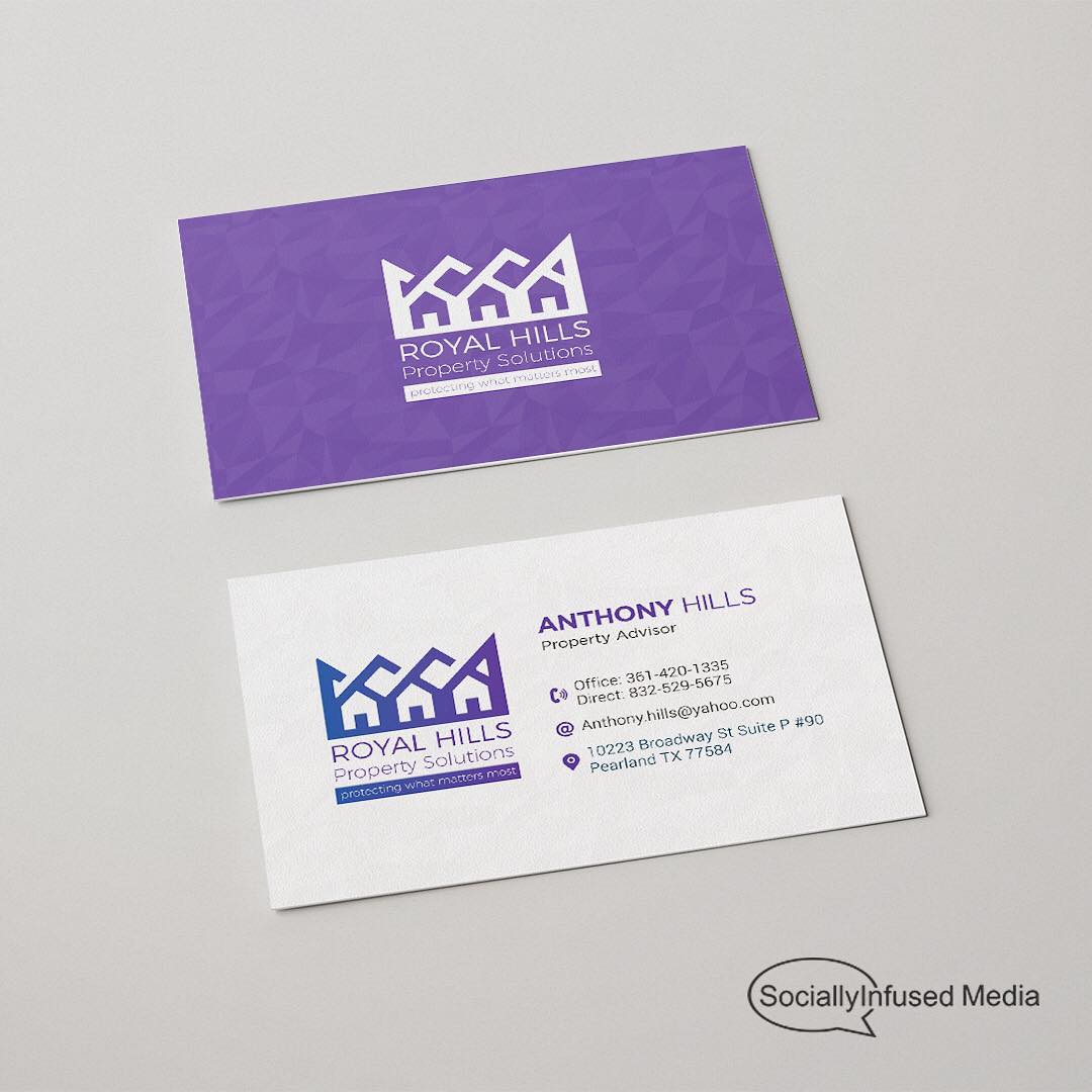
Our client wanted a hint of royalty to softly kiss his brand; nothing too over the top, arrogant or snooty. The subtly in the crown/house effect gave the image just enough of a luxurious feel. The coloration was spot on – we used a royal purple, as opposed to the stereotypical gold, platinum, and silvers that tend to be much more condescending.
Tags:
art / artwork / brand / brand identity / branding / business card design / business cards / creative / design / digitalart / graphic / graphic art / graphic design / graphics / illustration / illustrator / inspiration / photoshop / real estate / typography / vector / vector art / vector graphics / visual style
