Why should you have a website that’s mobile optimized?

You love your new website so much you’d marry it- if it could pay your bills.

Maybe it will one day, too. But it sure as heck won’t right now.

Why?

Because it looks terrible on a smartphone. 

The navigation is smaller than your mother-in-law’s mind. It won’t zoom in and out. It takes ages to load. In short, it’s just not presentable. 

You’ve gotta think mobile. Everyone these days has a smartphone unless they’re too young to talk, and even those folks may eventually find a way.

You’ll have mobile users checking out your site. Guaranteed. And if it’s not presentable, guess what they’ll think of your business?

Not professional.

You only get one chance to make a good impression. That’s especially true online. 

We can help to create the best mobile optimized website and make it so successful that you just might say “I do.”

Screenshot of the SociallyInfused website URL inserted into Google's mobile usability test website. Results show that the "Page is mobile friendly."
Example of a site (a remarkable site) being tested on Google's mobile friendly test.

FAQs for Mobile SEO

Mobile SEO (Mobile Search Engine Optimization) turns your site into a rockstar. Google will be begging to index it and your customers won’t want to click off.

Well, maybe that’s overstating it. But when the site is optimized for mobile, it’s way sexier for the search engines and viewers won’t think you’re an amateur. 

They might even buy something!

Over 60% of all Google searches are done on a mobile device. By the time you read this, that number will have gone up. 

Guaranteed.

That’s why you should make sure that your site is built for mobile SEO or find a really cool digital marketing agency to give it a facelift. 

Another reason is that Google has gotten really, really bossy these days. If your site isn’t optimized for the millions of smartphone users out there, you won’t be rewarded.

As in getting on page one in the search engine results pages (SERPs) from your SEO efforts.

You can still get there by buying ads, but why pay when you can get it for free but doing things right the first time?

Test it!

Your options include:

These tools can tell you if your website is mobile friendly, how it looks on different devices and its speed. 

In short, you’ll know if you’re on the right track or out in the middle of cyber-nowhere.

Do an audit, and don’t hold back.

  • Does the layout adjust automatically from one screen size to the next?
  • Can you read the text without having to zoom in?
  • Is there a lot of white space and zero clutter?
  • Does it load fast? If it takes more than three seconds to load, the answer is NO.
  • Are you using the right keywords for a mobile platform? The briefer, the better.

If you answered no to any of the above, you know what you have to do. Change them to YES.

The short answer is that if your site isn’t mobile, it might as well be invisible. As in no one will find it.

The long answer is that mobile SEO is now an essential part of your digital marketing strategy. If your site doesn’t load in under three seconds and look equally fabulous on all devices, your traffic will drop.

Google is big on protecting users from a crappy browsing experience. Ignore this mandate and you’ve only got yourself to blame.

The importance of mobile search

Mobile is here to stay. 

At one time, Google responded to search queries with a mix of mobile and desktop results. Not anymore.

Today, the Google algorithm ranks search results based ONLY on the mobile version of your site. It doesn’t matter whether you’re searching from a desktop or treetop. 

Without mobile, you don’t exist. If you don’t believe us, Google ‘Mobilegeddon.’

Now let’s do a deep dive into mobile first indexing.

Mobile first indexing

Did you pass the ‘Mobile First’ indexing test?

Let’s check!

Log into Google’s Search Console, enter your URL, and check the results.

If you see ‘Google Smartphone’ in the ‘crawled as’ result, major fist bump! You’re Mobile First all the way!

Quick question, though: do you have two websites? As in one for mobile and one for desktop?

A lot of people do. And it’s not a problem unless your mobile site is a SERIOUSLY lite version of the desktop one.

Don’t cut back. Convert instead. 

Put those images on a diet (fewer bytes, get it?) and create a mobile-friendly version of all your pages and assets.

There are certain elements you must keep the same between both version, such as:

  • Structures data
  • Metadata
  • Meta robot tags
  • Ad placement

Anything else is up for negotiation, but the closer they are to being twinsies, the better.

Screenshot of Google's search console displaying the crawl results. It shows Crawled as: Googlebot Smartphone.

Do you need assistance with designing a mobile website that will rank well on Google?

Get your free, no-obligation quote. We promise that you’ll feel super-comfortable chatting with us.

GET STARTED

What is a mobile-optimized website?

Want the ‘I survived Mobilegeddon T-shirt’? Get yourself a mobile optimized site

Here’s how.

Mobile UX

The mobile audience is an impatient one. They want to find what they’re looking for NOW.

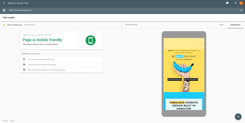
This means that you need to understand what a mobile optimized design looks like.

In short, they have:

  • Cool icons for common assets like shopping carts and contact pages
  • Lots of white space
  • Simplified navigation
  • Fingertip-sized touch screen targets

Mobile site speed

Your site needs to be fast. 

Did you know that even a one-second delay in load time reduces your page views by 11%? Your conversions by 7%?

Google has confirmed that site performance is one of its sweet spots, so get it excited by:

  • Compressing images
  • Cutting down on HTTP request load by minimizing your HTML or CSS file resizes. Gzip is great when you’re looking for quality shrinkage- even better than a cold shower!

Mobile keywords

Mobile keywords are the ultimate post-Mobilegeddon survival tool. 

You and your target audience use them to find each other across cyberspace. But you’ve gotta do some work before you hit gold.

Ready for your keyword discovery interview? Here goes!

  • Who is your target audience?
  • What questions do they have about my product or service?
  • What words do they use when searching for information online?

Get those answers right and if you build a site, they will follow.

Speaking of sites, you’re probably wondering if mobile keywords and desktop keywords are different. 

They sure are. Here’s why.

  • Mobile keywords are shorter: who has time for big words when you’re on the go?
  • They use LOTS of abbreviations.
  • They even use typos.

“WalMart holiday hours” is mobile. “When does Walmart close today?” is desktop.

See the difference?

Mobile local SEO

Local SEO connects you with local customers. 

Since mobile users are on the go, they’re big on location-based search, so you want to stand out. This means:

  • Geographical keywords like ‘Hamilton AC repairs’
  • Kickass customer reviews on your Google My Business page
  • Local citations like a link in the online Yellow Pages or your chamber of commerce website

Want to know more? Check out our local SEO services page!

What’s the bottom line on mobile SEO?

There you have it! The nitty-gritty on mobile SEO so you can nail your mobile optimization strategy in 2021 and beyond. We hope you and your site have a long and happy future together, but if you need some tips for boosting the relationship, check out the articles on our blog.