Logos are meant to help distinguish and define a brand. We create these ‘symbols’ because consumers are visual, and we want to create these connections and associations with our target audience― consider Pepsi, McDonald’s, or even Puma. What instantaneously pops into your head? Exactly, it’s most likely their logos. Great logos stick, resonate, and are also the reason someone chooses one product over another.
The execution of your perfect logo will be a huge advantage, but we’re here to offer up a few words of caution. So, we gathered up dozens of the worst logo designs of this decade and had our community vote on the top 5 winners (erm, losers). Without further ado, here are the 5 worst logos that our third parties have voted to the top (erm, the bottom).
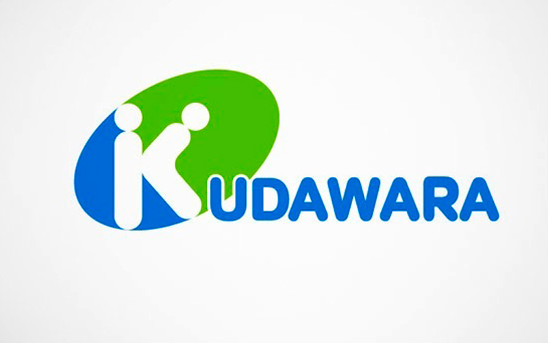
#5 Kudawara Pharmacy

A very special ‘K’
No insight into this logo from Kudawara Pharmacy is really necessary. But we are intrigued―what services are offered behind closed doors and where the $%&! do we sign up?
#4 Arlington Pediatric Center

“Trust me, I’m a doctor.”
While the Arlington Pediatric Center may very well employ magnificent physicians, the public might never be able to forget the misfortunate arch in this doctor’s back―changes everything.
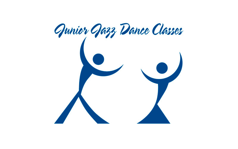
#3 Junior Jazz Dance Class

What a beautiful pair… of dancers.
Be careful when working with reversed and monochrome logos are you might have the unfortunate luck of an unintended optical illusion. We personally love this one. Who doesn’t love the alluring and natural curves of the female body? A junior dance center, no. But an adult entertainment nightclub, we’re in (unless the bouncer throws us out).
#2 The Computer Doctors

Is it spelt ‘cumputers’?
It’s an excellent idea for a logo, and I think we’ve even designed some similar concepts right here inhouse; however, this very happy mouse looks like something entirely different.
#1 Instituto de Estudos Orientais

And here is your champion.
A beautiful sun setting behind a shimmering golden temple. What takes this to a whole “nude” level is a simple and common design mistake―how the black lines for the roof were structured.
Some Lessons Learned
While this has been a fun, little exercise, there’s still a massive design and branding lesson here: ALWAYS get an outside perspective from a transparent, neutral and trustworthy third party. You want to make sure that what you see, others also see. Now get back to work and get your mind out of the gutter!
Are you looking for some logo design assistance? Check out our graphic design services today!

