
In today’s digital landscape, sites are locked in an endless struggle to capture attention. With just seconds to make a lasting impression, crafting a site that seamlessly blends captivating aesthetics with intuitive functionality is no longer a choice but a necessity.
This guide will serve as your compass. It will navigate you through the essential responsive design principles. Those form the bedrock of any successful web presence.
You’ll be well on your way to forging a site that transcends mere visual appeal. You’ll cultivate an engaging UX. It will foster trust, compel action, and convert visitors into loyal fans.
Embracing Responsive Design Principles
From tablets to smart TVs and everything in between, ensuring that your website offers an optimal viewing experience across all devices is paramount. This is where flexible design standards come in.
Flexible design dictates that a layout adjusts automatically based on the device’s screen size. Be it a desktop computer, a tablet, or a smartphone.
Embracing perfect responsive design is crucial for a business catering to a diverse audience. It ensures everyone who visits your site has a smooth and frustration-free experience, regardless of their device. Here’s why it matters:
- Improved User Engagement. A clunky, inflexible site is a surefire way to lose potential clients. Flexible design eliminates zooming, scrolling struggles, and distorted layouts. It keeps users engaged and navigates your site seamlessly.
- Enhanced SEO (Search Engine Optimization). Google prioritizes mobile-friendly sites in search rankings. Flexible design ensures your site remains discoverable across all devices. It boosts your web visibility and attracts more potential clients.
- Brand Consistency. Quality responsive design maintains a consistent brand image across all platforms, reinforcing your brand identity and professionalism.
By adopting design standards, you create a single site that adapts to any device. This saves you time and resources when managing separate mobile and desktop versions.
What Is Good Design? Defining Quality
Good web design strikes a delicate balance between aesthetics and usability. It’s about creating a site that’s visually appealing and intuitive. Here are the hallmarks of a quality design:
- Clarity and Simplicity. A clean, uncluttered interface with straightforward navigation allows users to find what they need quickly and easily.
- Visual Hierarchy. Strategic placement of key elements—like headlines, calls to action, and important information—guides users’ eyes through the page and ensures a smooth user flow.
- Usability. Intuitive navigation, calls to action, and logical structure are good design representatives. Visitors should be able to navigate the site effortlessly. They must complete desired actions without confusion.
- Accessibility. Ensuring your site is accessible to users with disabilities is not only ethical. It can also expand your potential client base. It includes features like alt text for images, proper colour contrast, and keyboard navigation options.
Good design isn’t static – it continuously evolves. Incorporate user feedback and analytics data. Then, you can refine your site based on real-world user interactions. User surveys, A/B testing, and heat maps are valuable tools. They are for understanding user behaviour and optimizing your site for maximum impact.
The Aesthetics of Web Design: Beyond Functionality
Functionality remains the cornerstone of a successful site. However, aesthetics play a crucial role in UX and brand perception. Beautiful web design goes beyond visual appeal. It creates an emotional connection with the user and fosters brand recognition.
Here’s how visual elements contribute to site aesthetics and perfect design:
- Colour. Colours evoke emotions and set the overall tone of your website. A well-chosen colour palette aligns with your brand identity. It resonates with your TA.
- Typography. The right fonts can elevate the aesthetic and enhance readability. Choose clear, professional fonts that complement your brand voice and content.
- Layout. A well-organized layout creates a sense of balance and visual harmony. Grid-based layouts and white space ensure elements are positioned logically and spaced appropriately for optimal readability.
Hamilton’s digital landscape is bustling with competition. Here’s how leveraging quality design aesthetics can help your business stand out:
- Brand Identity. Cohesive and aesthetically pleasing design elements reinforce your brand identity across all platforms. They are logos, colours, and fonts.
- Emotional Connection. Beautiful visuals can create an emotional connection with users. It fosters trust and brand loyalty.
- User Engagement. A visually appealing site keeps users engaged and encourages them to explore further. It increases the likelihood of them converting into clients.
Sound Web Design Principles: The Usability Factor
In today’s digital world, users expect sites to be not just visually appealing. They must also be incredibly user-friendly. Here’s where the concept of usability comes in. Usability refers to how easy and intuitive a site is to navigate and use. A site with solid usability keeps users engaged. It facilitates task completion and drives conversions.
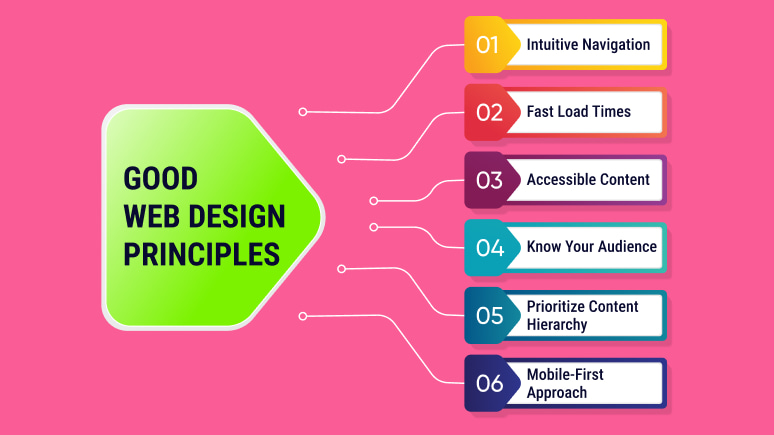
What are the core principles of responsive web design? Here they are:
- Intuitive Navigation. Navigation should be clear, consistent, and predictable. Users should be able to find what they need quickly and effortlessly. Use a consistent menu structure across all pages. Implement clear labelling for buttons and links. Consider incorporating a sitemap for complex sites.
- Fast Load Times. Nobody enjoys waiting for a site to load. Slow loading times frustrate users and negatively impact SEO. Optimize image sizes, leverage browser caching, and choose a reliable web hosting provider. It’s to ensure your site loads quickly on all devices.
- Accessible Content. Accessibility is also what a good design representative is. It ensures everyone has a positive experience on your site. It’s regardless of their abilities. It includes alt text, proper colour contrast, and keyboard navigation options.
The main principles of beautiful web design for users:
- Know Your Audience. When designing your site, consider the diverse audience you cater to in Hamilton. Understand their demographics, needs, and web behaviour. It allows you to tailor your content, language, and navigation.
- Prioritize Content Hierarchy—Structure content to guide users’ attention towards critical information. Use clear headings, subheadings, and bullet points to break down complex information and ensure users can quickly scan and find what they need.
- Mobile-First Approach. With the rise of mobile browsing, adopting a mobile-first design approach is crucial. It means ensuring your site is optimized for smaller screens and provides a seamless UX across all devices. Consider using responsive design principles to achieve this.
Focus on these standards and strategies. Then, you can create a user-friendly and accessible site that will cater to your diverse audience in Hamilton and beyond. Remember, a well-designed site looks good, facilitates user engagement, and helps your business achieve its web goals.
Optimizing for Performance and SEO
While aesthetics are important, a beautiful site is only half the battle. Optimizing your site’s performance and search engine optimization (SEO) ensures it looks good, functions smoothly, and ranks higher in search results pages (SERPs).
Besides the “What are the core principles of responsive web design?” issue, technical aspects of web design are also important:
- Site Speed. Slow loading times negatively impact user experience and SEO ranking. Optimize image sizes, leverage browser caching, and minify code. It will ensure your site loads quickly.
- Technical SEO involves optimizing the backend structure for engines to crawl and index your content. It includes factors like mobile friendliness, URL structure, and sitemap creation.
- Content Quality. Search engines prioritize sites with high-quality, relevant content that provides value to users. Focus on creating informative, engaging info targeting keywords relevant to your Hamilton-based business.
Creating a visually appealing site that adheres to SEO best practices is achievable. Here’s how:
- Image Optimization. High-quality images enhance visual appeal. However, large file sizes can slow down loading times. Use image compression techniques and alt text with relevant keywords. Considering sound web design principles helps to improve SEO.
- Keyword Integration. Incorporate target keywords naturally throughout your site content, including headings, meta descriptions, and body text. However, prioritize readability and user experience over keyword stuffing.
- Internal Linking. Structure your site with internal links that connect relevant pages. It improves user navigation. It helps search engines understand the hierarchy of your content.
Incorporating Feedback for Continuous Improvement
Web design is an iterative process. The best sites are constantly evolving based on user feedback and data analysis. As the principles of beautiful web design, you must adhere to continuous improvement:
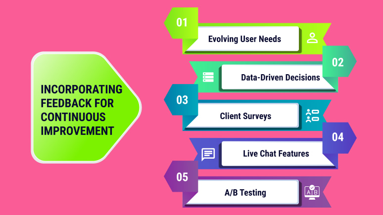
- Evolving User Needs. User needs and web behaviour constantly change. Gathering user feedback allows you to adapt your site to stay relevant and meet expectations.
- Data-Driven Decisions. Analytics tools provide valuable insights into user behaviour and performance. Analyze data to identify areas for improvement. They are content that doesn’t resonate or pages with high bounce rates.
Engage your Hamilton audience to generate a continuous stream of valuable feedback:
- Client Surveys. Send out surveys or questionnaires periodically. It’s to gather user opinions and suggestions on site functionality and design.
- Live Chat Features. Implement live chat features that allow users to provide instant feedback.
- A/B Testing. As good web design principles, test different design elements and content variations. Do it via A/B testing. It’s to see which versions generate better results and user engagement.
Remember, a site that adapts and evolves thrives in the competitive digital landscape.


